Centers for Medicare & Medicaid
Optimizing Back-End data pipelines to power better cusotmer facing experiences to increase conversions.
CMS.gov
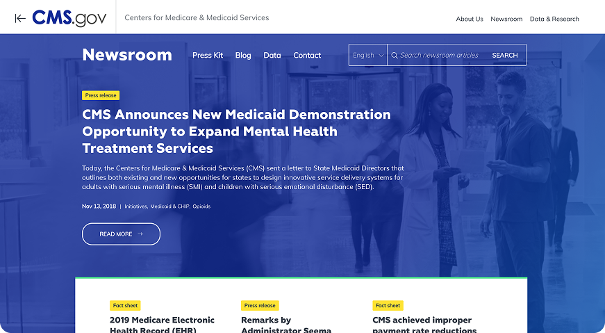
Redefining the Federal Web Aesthetic
Leveraging UI & Visuals to drive more coherent experiences for federal mandates and policy changes.
The Problem
The Opportunity
Center for Medicare & Medicaid Services had dense legal language, articles, mandates, with a lack of visual cues and a series of navigational challenges for an older demographic.
CMS.gov Newsroom had the opportunity to create a visual refresh for the micro-site where I proposed a bolder approach leveraging white space for readability and unique UI elements to drive customer comprehension through 508 compliant and accessibility standards.
OVERVIEW
User base: doctors, caregivers, journalists, & recipients of medicare
Navigating legal language, archived documents, & changing policies
Accessibility standards & 508 compliance is at the forefront of design decisions.
MONTSERRAT EXTRABOLD
Aa
Ff
SUBHEADER
MULI BLACK
MULI BOLD ITALIC
BODY
MULI LIGHT
MULI REGULAR
MULI SEMIBOLD
METADATA
MULI BLACK
Bb
Gg
Cc
Hh
Dd
Ii
Ee
Jj
H5
H4
H3
H2
H1
24px
32px
42px
48px
64px
#0C60F4
#07DA25
#FFDF00
Add a Title
GOALS
Blend the existing design system with new visual elements not currently associated with the CMS.gov redesign. Expand the color palette with slightly brighter, bolder, and varying monochromatic hues to identify certain areas for particular audiences.
SAFE ROAD
Attributes
TONAL COLOR PALETTE
MODULAR LAYOUT
CLEAN & SOPHISTICATED
LARGE PHOTOGRAPHY
OFF ROAD
Attributes
HIGH CONTRAST
BRIGHT COLORS
UNIQUE GRAPHIC TREATMENTS
SURPRISING DESIGN ELEMENT
SIDE ROAD
Attributes
BOLD, TYPE TREATMENTS
DISTINCT ILLUSTRATIONS
POSITIVE AND NEGATIVE SPACE
CLEAN, NOT CLINCAL


::link-default
Statement from CMS Administrator Dr. Mehmet Oz
::link-hover
Statement from CMS Administrator Dr. Mehmet Oz
::link-clicked
Statement from CMS Administrator Dr. Mehmet Oz
::primary-button-default
::secondary-button-default

.png)
